
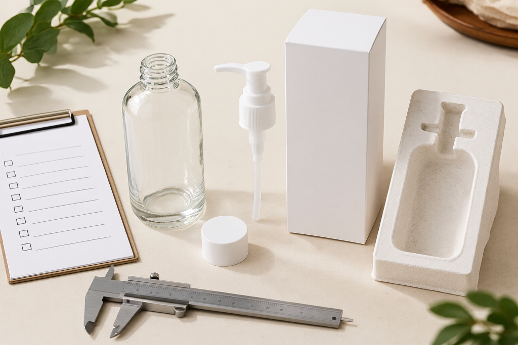
The finish of a glass bottle changes how the product looks, how the label reads and how the package feels in use. Clear, frosted and colored appearances can support very different design directions. Choosing between them is easier when you review the formula, artwork and closure alongside the bottle.
Use clear glass when visibility matters
Clear glass allows the contents and fill level to become part of the presentation. This can work well when the formula’s appearance supports the brand direction. Review a filled sample rather than an empty bottle alone: liquid color, bubbles, the dip tube and the bottle’s base can change the overall impression.
Also check the label from both sides. On a transparent bottle, artwork on the back may be visible through the contents, particularly where the design uses large unprinted areas.
Confirm how a frosted appearance is achieved
Frosting creates a softer appearance, but the word describes a visual result rather than one universal process. Ask how the proposed finish is produced and which areas of the bottle are treated. Different processes can affect the look, texture and suitability of subsequent decoration.
Examine a physical sample under ordinary lighting. Check whether the finish is consistent around the shoulders and base, and discuss the intended label or printing method with the decorator. Do not assume a finish will accept any adhesive or ink without a sample review.
Distinguish colored glass from surface color
A colored appearance may come from the glass itself or from a surface coating. Clarify the proposed method before comparing quotations. The two approaches can differ in appearance at the neck, rim and base, as well as in the way surface decoration is applied.
A dark or amber appearance is not enough evidence for a specific level of light protection. If the formula has light sensitivity requirements, ask for relevant material information and testing appropriate to the product.
Review finish and decoration together
Compare the bottle, cap, label and printed artwork in one sample set. Metallic finishes, dark coatings and translucent glass can look different under studio lighting and in normal use. A color reference helps communicate the direction, but it should be supported by an agreed physical sample.
- Identify the glass or coating method.
- Define the treated areas and any clear windows.
- Confirm artwork size, placement and color references.
- Evaluate decoration adhesion and surface durability for the intended use.
Create a consistent approval record
If your range contains several capacities or colors, compare them side by side. Record the finish reference, artwork version and cap finish for each combination. Keep unresolved requirements separate from approved details so later samples can be checked without ambiguity.
Send your finish references and artwork direction for a packaging discussion based on the complete presentation.